Elastic modulus vs Hardness plot
Another way to visualize the distribution of mechanical property results is to plot for example the elastic modulus (E) values vs the hardness (H) values. Such a plot leads sometimes to the observation of families of points and the definition of “sectors” or “bubbles”, each one corresponding to a single phase (e.g. soft matrix vs hard and stiff particles).
The correlation between elastic and plastic properties has been extensively studied in the literature [9], [4], [21] and [14].
Note
Elastic modulus is an intrinsic material property and hardness is an engineering property, which can be related to yield strength for some materials.
E-H map sectorization
As a first analysis of such a plot, sectors can be defined by giving an average value of elastic modulus and an average of hardness value, separating respectively by an horizontal line and a vertical line the different bubbles of points. Each sector is defined by a unique color.
Finally, average values of mechanical properties are given for each sectors directly into the graph, and a 4 color-coded map corresponding to this plot can be generated (see 2nd figure).
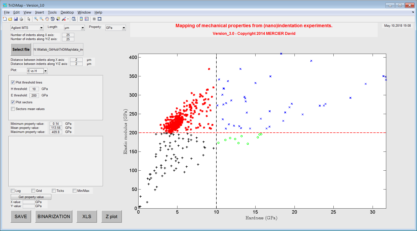
Figure 32 Example of sectorized elastic modulus vs hardness plot
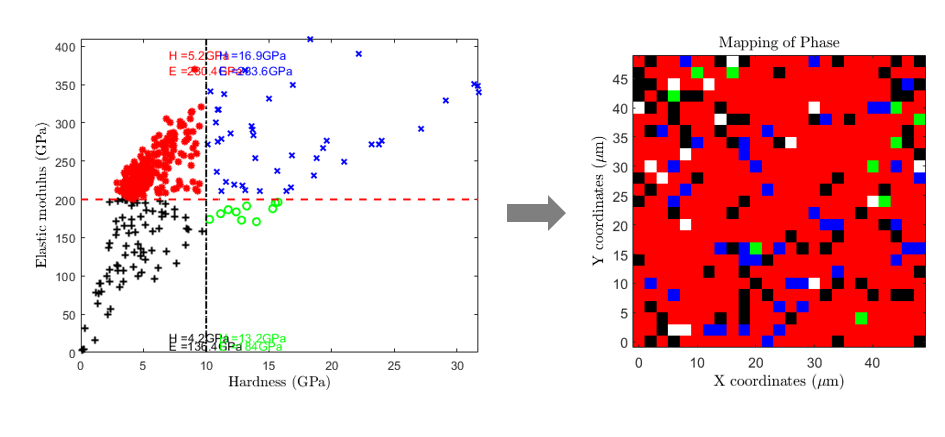
Figure 33 Sectorized elastic modulus vs hardness plot with mean values and corresponding mechanical map
Automated cluster analysis (K-Means, Gaussian Mixture, …)
Cluster analysis, or clustering, is an unsupervised machine learning technique used to group similar data points based on inherent patterns or features. Common clustering algorithms include K-Means and Gaussian Mixture Models (GMMs), both of which are widely applied to nanoindentation datasets. For instance, a recent comparative study explores the performance of various clustering methods on nanoindentation mapping data [2]. These techniques are usually applied to E-H plots. But it is also possible to add a 3rd property (E/H or Kernel average mechanical mismatch…) to help the clustering analysis [19].
K-Means models
K-Means clustering is frequently used for the analysis of nanoindentation data [13], [12], [1], [11]. As explained in [13], the K-Means algorithm aims to partition n observations into k clusters, where each observation belongs to the cluster with the nearest mean—this mean serving as a prototype of the cluster. The number of clusters k is predefined, and each point is assigned exclusively to one cluster.
Initially, k cluster centroids are randomly initialized. Each data point is then assigned to the cluster whose centroid is closest in terms of Euclidean distance. After all points are assigned, the algorithm recalculates the centroids as the mean of the points in each cluster. This process—assignment followed by centroid update—is repeated iteratively until convergence. A concise description of this method is also available in the Matlab documentation [16].
A possible Matlab third party code, which could be used to define clusters with K-Means model is: https://www.mathworks.com/matlabcentral/fileexchange/24616-kmeans-clustering?s_tid=mwa_osa_a
Gaussian mixture models
The GMMs model are as well used for nanoindentation data clustering [24] and [7]. This method is well described in the Matlab documentation [15], [17] and [18] but also in the literature [8].
This method is powerful to separate contribution of 2 or 3 phases (especially in the case of a soft metallic matrix with hard ceramic particles) in the cloud of experimental points [10]. Average mechanical property values can also be extracted using this method and a 2 or 3 color map can be obtained too.
The influence of indentation size and spacing on statistical phase analysis has also been studied by fast mapping indentation anc clustering analysis [5].
The Matlab third party code used to define clusters with GMs model is: GMMClustering.m
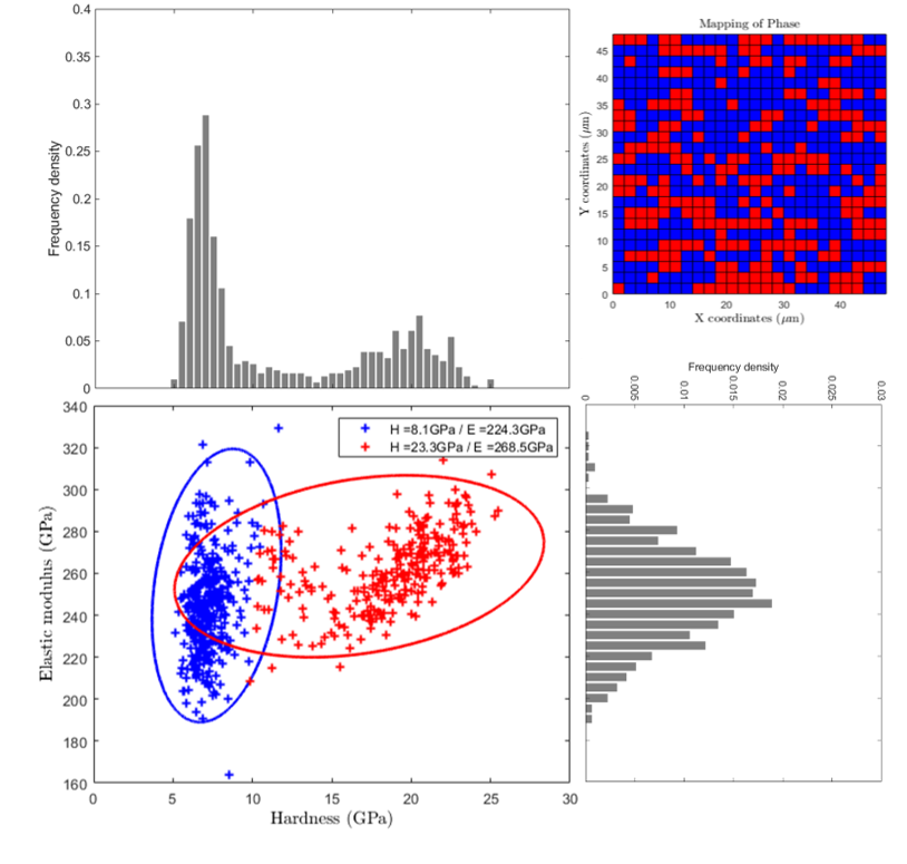
Figure 34 Elastic modulus vs hardness plot with clusters of points obtained with GMM
Determination of the number of clusters
The optimal number of clusters (k) can be determined using the elbow method. This method looks at the total within-cluster sum of square (WSS) as a function of the number of clusters. One should choose a number of clusters so that adding another cluster doesn’t improve much better the total WSS.
This method can be defined as follow in 4 steps: 1) Compute clustering algorithm (e.g., K-Means or GMs algorithms) for different values of k. 2) For instance, by varying k from 1 to 5 clusters. For each k, calculate the total WSS. 3) Then, plot the curve of WSS according to the number of clusters k. 4) Finally, the location of a bend (knee) in the plot is generally considered as an indicator of the appropriate number of clusters.
Note that, the elbow method is sometimes ambiguous. Alternatives are for example the average silhouette method or the gap statistic method…
KAMM analysis (Kernel-Averaged Mechanical Mismatch)
A recent development in nanoindentation data analysis is the introduction of the Kernel-Averaged Mechanical Mismatch (KAMM) descriptor, which enhances clustering and phase identification in mechanical property maps. [arxiv.org] Conventional analyses based solely on elastic modulus (E) and hardness (H) may struggle to distinguish phases when the mechanical contrast is low or when diffuse interphase regions exist. This limitation is particularly critical in multiphase materials such as composites, alloys, or cementitious systems. [arxiv.org] The KAMM approach addresses this issue by introducing a neighborhood-aware metric that quantifies the local mechanical heterogeneity. Instead of considering each indentation point independently, KAMM evaluates the mismatch between a data point and its surrounding neighbors in the (E, H) space. This effectively captures spatial correlations and mechanical gradients within the dataset. [arxiv.org] By incorporating KAMM as an additional feature, clustering can be performed in an augmented three-dimensional space (E, H, KAMM). This extension significantly improves:
Phase separability Detection of interphase regions Robustness to experimental noise [arxivlens.com]
This method is particularly advantageous for datasets exhibiting:
Low contrast between phases Gradual transitions (graded interfaces) Complex or diffuse morphologies
Another key contribution of this framework is the use of realistic synthetic benchmarks with controlled complexity (e.g., curved boundaries, diffuse phases, tunable contrast), enabling more rigorous validation of clustering approaches compared to overly simplistic datasets. [arxiv.org] Finally, KAMM-enhanced clustering facilitates downstream applications such as:
Generation of representative volume elements (RVEs) Improved extraction of phase-specific mechanical properties Integration into ICME (Integrated Computational Materials Engineering) workflows [arxiv.org]
This approach can be combined with standard clustering methods (K-Means, GMM, Agglomerative clustering, etc.), providing a flexible and powerful extension to existing E–H map analysis techniques.
Next steps: Ashby map or self-organized maps
The next step after the different analytical, sectorization, clustering… approaches, could be to use nanoindentation outputs (phase mechanical properties in the case of a composite, an alloy…) for material selection, material design, material discovery….
A common strategy for material selection is the usage of conventional Ashby map [3]. An example of a typical Ashby map is given afterwards with materials families (envelops around different materials), using the CES Selector 2018 software [6]. At some point, it is possible to add material reference (bulk, homogeneous, monophasic, …) values on the E-H map, in order to compare experimental data with data from the literature.
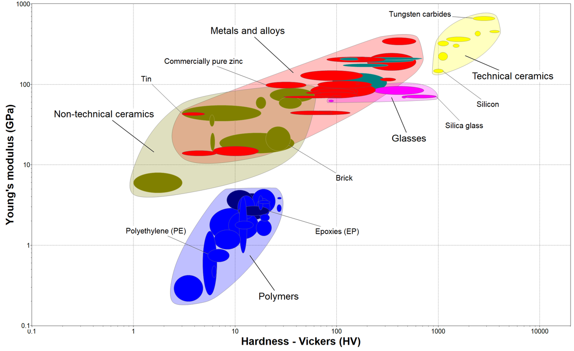
Figure 35 Typical Ashby map of elastic modulus vs Vickers hardness, obtained using CES Selector software
Regarding material design or material discovery, an option is the usage of self-organized maps (SOMs) [22] in the framework of material informatics. Here an example for Atomic Force Microscopy (AFM) technique [23].